Mouse Aging clustering analysis and annotation#
The Mouse Aging dataset [Jin et al] is a comprehensive single-cell RNA sequencing (scRNA-seq) dataset containing ~1.2 million high-quality single-cell transcriptomes of brain cells from young adult and aged mice of both sexes, from regions spanning the forebrain, midbrain, and hindbrain. High-resolution de novo clustering of all cells results in 847 cell clusters and reveals at least 14 age-biased clusters that are mostly glial types. Clusters in the study were mapped to the whole mouse brain taxonomy (WMB-taxonomy, Yao et al.) to provide class, subclass and supertype annotations. At the broader cell subclass and supertype levels, age-associated gene expression signatures were analyzed resulting in a list of 2,449 differentially expressed genes (age-DE genes) for many neuronal and non-neuronal cell types.
The purpose of this set of notebooks is to provide an overview of the data, the file organization, and how to combine data and metadata through example use cases.
You need to be connected to the internet to run this notebook or connected to a cache that has the Aging Mouse data downloaded already. Make sure to have run the getting_started notebook as well if you haven’t already done so and familiarized yourself with the cache object.
The notebook presented here shows quick visualizations from precomputed metadata in the atlas. For examples on accessing the expression matrices, specifically selecting genes from expression matrices, see the general_acessing_10x_snRNASeq_tutorial.ipynb tutorial/example.
import pandas as pd
from pathlib import Path
import numpy as np
import anndata
import matplotlib.pyplot as plt

from abc_atlas_access.abc_atlas_cache.abc_project_cache import AbcProjectCache
We will interact with the data using the AbcProjectCache. This cache object tracks which data has been downloaded and serves the path to the requested data on disk. For metadata, the cache can also directly serve up a Pandas Dataframe. See the getting_started notebook for more details on using the cache including installing it if it has not already been.
Change the download_base variable to where you have downloaded the data in your system.
download_base = Path('../../data/abc_atlas')
abc_cache = AbcProjectCache.from_cache_dir(download_base)

abc_cache.current_manifest
'releases/20250531/manifest.json'
Data overview#
Cell metadata#
Essential cell metadata is stored as a DataFrame. Each row represents one cell indexed by a cell label. The cell label is the concatenation of barcode and name of the sample. In this context, the sample is the barcoded cell sample that represents a single load into one port of the 10x Chromium. Note that cell barcodes are only unique within a single barcoded cell sample and that the same barcode can be reused. The barcoded cell sample label or name is unique in the database.
Each cell is associated with a library label, library method, donor label, donor sex, dissection region_of_interest_label, the corresponding coarse anatomical division label and the matrix_prefix identifying which data package this cell is part of.
Further, each cell is associated with a cluster alias representing which cluster this cell is a member of and (x, y) coordinates of the cells in the UMAP.
Below, we load the first of the metadata used in this tutorial. This pattern of loading metadata is repeated throughout the tutorials.
abc_cache.list_metadata_files('Zeng-Aging-Mouse-10Xv3')
['cell_annotation_colors',
 'cell_cluster_annotations',
 'cell_metadata',
 'cluster',
 'donor',
 'example_genes_all_cells_expression',
 'library',
 'value_sets']
abc_cache.list_metadata_files('Zeng-Aging-Mouse-WMB-taxonomy')
['aging_degenes',
 'cell_cluster_mapping_annotations',
 'cell_cross_mapping_annotations',
 'cluster_mapping',
 'cluster_mapping_pivot']
cell = abc_cache.get_metadata_dataframe(
    directory='Zeng-Aging-Mouse-10Xv3',
    file_name='cell_metadata',
    dtype={'cell_label': str,
           'wmb_cluster_alias': 'Int64'}
)
cell.set_index('cell_label', inplace=True)
print("Number of cells = ", len(cell))
cell.head()
Number of cells = 1162565
| cell_barcode | gene_count | umi_count | doublet_score | x | y | cluster_alias | cell_in_wmb_study | wmb_cluster_alias | library_label | ... | donor_label | population_sampling | donor_genotype | donor_sex | donor_age | donor_age_category | donor_in_wmb_study | feature_matrix_label | dataset_label | abc_sample_id | |
|---|---|---|---|---|---|---|---|---|---|---|---|---|---|---|---|---|---|---|---|---|---|
| cell_label | |||||||||||||||||||||
| AAACCCAAGGACACTG-367_B04 | AAACCCAAGGACACTG | 6176 | 26113.0 | 0.09 | -2.288070 | 3.757430 | 273 | True | 1067 | L8TX_200924_01_G05 | ... | Snap25-IRES2-Cre;Ai14-544400 | unbiased | Snap25-IRES2-Cre/wt;Ai14(RCL-tdT)/wt | F | P58 | adult | True | Zeng-Aging-Mouse-10Xv3 | Zeng-Aging-Mouse-10Xv3 | 5ec753a4-d8b7-4ddf-a169-cc678ae9a073 |
| AAACCCAAGTAAACGT-367_B04 | AAACCCAAGTAAACGT | 3717 | 10926.0 | 0.05 | 1.104098 | 11.232103 | 787 | True | 14939 | L8TX_200924_01_G05 | ... | Snap25-IRES2-Cre;Ai14-544400 | unbiased | Snap25-IRES2-Cre/wt;Ai14(RCL-tdT)/wt | F | P58 | adult | True | Zeng-Aging-Mouse-10Xv3 | Zeng-Aging-Mouse-10Xv3 | 7eca8d84-e6ad-4e09-98df-06eefd4b5bc3 |
| AAACCCACATTGAGCT-367_B04 | AAACCCACATTGAGCT | 1358 | 2054.0 | 0.02 | -2.465144 | 17.637245 | 833 | True | 5255 | L8TX_200924_01_G05 | ... | Snap25-IRES2-Cre;Ai14-544400 | unbiased | Snap25-IRES2-Cre/wt;Ai14(RCL-tdT)/wt | F | P58 | adult | True | Zeng-Aging-Mouse-10Xv3 | Zeng-Aging-Mouse-10Xv3 | c69b1ea1-ce82-4396-a9c4-9e16eef19e9a |
| AAACGAAAGCCGTAAG-367_B04 | AAACGAAAGCCGTAAG | 3103 | 6899.0 | 0.03 | 1.328812 | 10.103676 | 787 | True | 14947 | L8TX_200924_01_G05 | ... | Snap25-IRES2-Cre;Ai14-544400 | unbiased | Snap25-IRES2-Cre/wt;Ai14(RCL-tdT)/wt | F | P58 | adult | True | Zeng-Aging-Mouse-10Xv3 | Zeng-Aging-Mouse-10Xv3 | 6a4b7938-43aa-4ccd-a1e2-3b9ed9fd3aac |
| AAACGAAAGCTACAAA-367_B04 | AAACGAAAGCTACAAA | 4459 | 16420.0 | 0.09 | 16.493496 | 2.265491 | 815 | True | 5230 | L8TX_200924_01_G05 | ... | Snap25-IRES2-Cre;Ai14-544400 | unbiased | Snap25-IRES2-Cre/wt;Ai14(RCL-tdT)/wt | F | P58 | adult | True | Zeng-Aging-Mouse-10Xv3 | Zeng-Aging-Mouse-10Xv3 | 55093777-2fe9-4f8a-b0e5-68a430f142d0 |
5 rows × 27 columns
We can use pandas groupby function to see how many unique items are associated for each field and list them out if the number of items is small.
def print_column_info(df):

    for c in df.columns:
        grouped = df[[c]].groupby(c).count()
        members = ''
        if len(grouped) < 30:
            members = str(list(grouped.index))
        print("Number of unique %s = %d %s" % (c, len(grouped), members))
print_column_info(cell)
Number of unique cell_barcode = 997258
Number of unique gene_count = 9838
Number of unique umi_count = 81632
Number of unique doublet_score = 874
Number of unique x = 1147449
Number of unique y = 1147537
Number of unique cluster_alias = 847
Number of unique cell_in_wmb_study = 2 [False, True]
Number of unique wmb_cluster_alias = 2656
Number of unique library_label = 287
Number of unique alignment_job_id = 287
Number of unique library_method = 2 ['10Xv3', '10xV3.1']
Number of unique barcoded_cell_sample_label = 287
Number of unique enrichment_population = 6 ['Calcein-positive, Hoechst-positive', 'Hoechst-positive', 'No FACS', 'RFP-positive, Calcein-positive, Hoechst-positive', 'RFP-positive, DAPI-negative', 'RFP-positive, Hoechst-positive']
Number of unique region_of_interest_label = 16 ['HPF - ENT', 'HPF - HIP', 'HPF - PAR-POST-PRE-SUB-ProS', 'HY - HY', 'Iscortex  - ACA', 'Isocortex  - AI', 'Isocortex - PL-ILA-ORB', 'Isocortex - RSP', 'MB - PAG-RAmb', 'MB - VTA-SN', 'P - Pmot/sat-ant', 'P - Pmot/sat-post', 'PAL - PAL', 'STR - STRd', 'STR - STRv', 'STR - sAMY']
Number of unique anatomical_division_label = 7 ['HPF', 'HY', 'Isocortex', 'MB', 'P', 'PAL', 'STR']
Number of unique library_in_wmb_study = 2 [False, True]
Number of unique donor_label = 108
Number of unique population_sampling = 2 ['Snap25+ neurons', 'unbiased']
Number of unique donor_genotype = 3 ['Ai14(RCL-tdT)/wt', 'Snap25-IRES2-Cre/wt;Ai14(RCL-tdT)/wt', 'wt/wt']
Number of unique donor_sex = 2 ['F', 'M']
Number of unique donor_age = 30
Number of unique donor_age_category = 2 ['adult', 'aged']
Number of unique donor_in_wmb_study = 2 [False, True]
Number of unique feature_matrix_label = 1 ['Zeng-Aging-Mouse-10Xv3']
Number of unique dataset_label = 1 ['Zeng-Aging-Mouse-10Xv3']
Number of unique abc_sample_id = 1162565
Cell metadata colors#
Below we load a DataFrame containing name and color mappings pre-cell for donor sex, region of interest, and anatomical division. This DataFrame is indexed by cell the same as the above cell_metadata. This allows us to label the UMAP with the previously mentioned distinct labels.
cell_colors = abc_cache.get_metadata_dataframe(
    directory='Zeng-Aging-Mouse-10Xv3',
    file_name='cell_annotation_colors'
).set_index('cell_label')
cell_colors.head()
| anatomical_division_color | anatomical_division_order | donor_age_category_color | donor_age_category_order | donor_sex_color | donor_sex_order | region_of_interest_color | region_of_interest_order | |
|---|---|---|---|---|---|---|---|---|
| cell_label | ||||||||
| AAACCCAAGGACACTG-367_B04 | #98D6F9 | 2 | #9ACA3C | 0 | #FAAA5B | 0 | #98D6F9 | 7 |
| AAACCCAAGTAAACGT-367_B04 | #98D6F9 | 2 | #9ACA3C | 0 | #FAAA5B | 0 | #98D6F9 | 7 |
| AAACCCACATTGAGCT-367_B04 | #98D6F9 | 2 | #9ACA3C | 0 | #FAAA5B | 0 | #98D6F9 | 7 |
| AAACGAAAGCCGTAAG-367_B04 | #98D6F9 | 2 | #9ACA3C | 0 | #FAAA5B | 0 | #98D6F9 | 7 |
| AAACGAAAGCTACAAA-367_B04 | #98D6F9 | 2 | #9ACA3C | 0 | #FAAA5B | 0 | #98D6F9 | 7 |
We will merge these two DataFrames to create one that contains both cell metadata and color information, ready to plot on a UMAP. We also shuffle the cell metadata to get a more representative plot in the UMAP. This is done as the default DataFrame is sorted cell_id which correlates with some of the metadata (e.g. age).
cell_extended = cell.join(cell_colors, rsuffix='_cl_colors')
cell_extended = cell_extended.sample(frac=1, random_state=12345)
cell_extended.head()
| cell_barcode | gene_count | umi_count | doublet_score | x | y | cluster_alias | cell_in_wmb_study | wmb_cluster_alias | library_label | ... | dataset_label | abc_sample_id | anatomical_division_color | anatomical_division_order | donor_age_category_color | donor_age_category_order | donor_sex_color | donor_sex_order | region_of_interest_color | region_of_interest_order | |
|---|---|---|---|---|---|---|---|---|---|---|---|---|---|---|---|---|---|---|---|---|---|
| cell_label | |||||||||||||||||||||
| GCCTGTTGTGAATTAG-135_B01 | GCCTGTTGTGAATTAG | 6777 | 37834.0 | 0.200000 | -1.185296 | 1.881103 | 278 | True | 1079 | L8TX_190716_01_D07 | ... | Zeng-Aging-Mouse-10Xv3 | b801b060-42b7-465c-a768-1a9b8dd9de7f | #98D6F9 | 2 | #9ACA3C | 0 | #FAAA5B | 0 | #80CDF8 | 8 |
| TCCGAAAGTGAAGCGT-761_A04 | TCCGAAAGTGAAGCGT | 3396 | 9585.0 | 0.030303 | 14.007499 | -0.220336 | 817 | False | <NA> | L8TX_210805_01_H01 | ... | Zeng-Aging-Mouse-10Xv3 | a59a8bc8-3c52-4d77-bebf-4ebf31e8d079 | #7ED04B | 1 | #CC6828 | 1 | #FAAA5B | 0 | #7ED04B | 4 |
| TTACCATGTCGTGGTC-327_A06 | TTACCATGTCGTGGTC | 4294 | 10527.0 | 0.020000 | 6.550781 | -1.378886 | 804 | False | <NA> | L8TX_200813_01_H10 | ... | Zeng-Aging-Mouse-10Xv3 | 2e5da533-b920-4707-aba1-d27f04ce5018 | #8599CC | 3 | #CC6828 | 1 | #735AA6 | 1 | #8599CC | 10 |
| ACGGGTCGTACGAGCA-385_D06 | ACGGGTCGTACGAGCA | 2943 | 6957.0 | 0.000000 | 13.650183 | 0.289086 | 817 | False | <NA> | L8TX_201008_01_A12 | ... | Zeng-Aging-Mouse-10Xv3 | 8b63cdce-4d15-4e88-b154-c29fd0e23ff1 | #E64438 | 4 | #CC6828 | 1 | #735AA6 | 1 | #E64438 | 11 |
| CTTAGGATCTGTCCCA-301_B04 | CTTAGGATCTGTCCCA | 7907 | 47406.0 | 0.037037 | 6.583878 | -10.639808 | 152 | False | <NA> | L8TX_200723_01_B10 | ... | Zeng-Aging-Mouse-10Xv3 | 8c290798-5c6e-42d9-a906-bfb69ec4399b | #7ED04B | 1 | #CC6828 | 1 | #FAAA5B | 0 | #72D569 | 6 |
5 rows × 35 columns
UMAP spatial embedding: Donor and anatomic information#
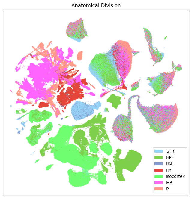
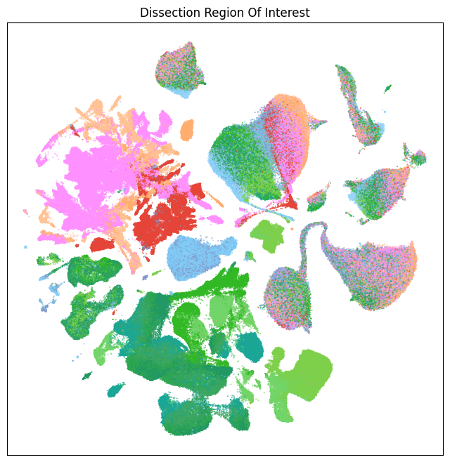
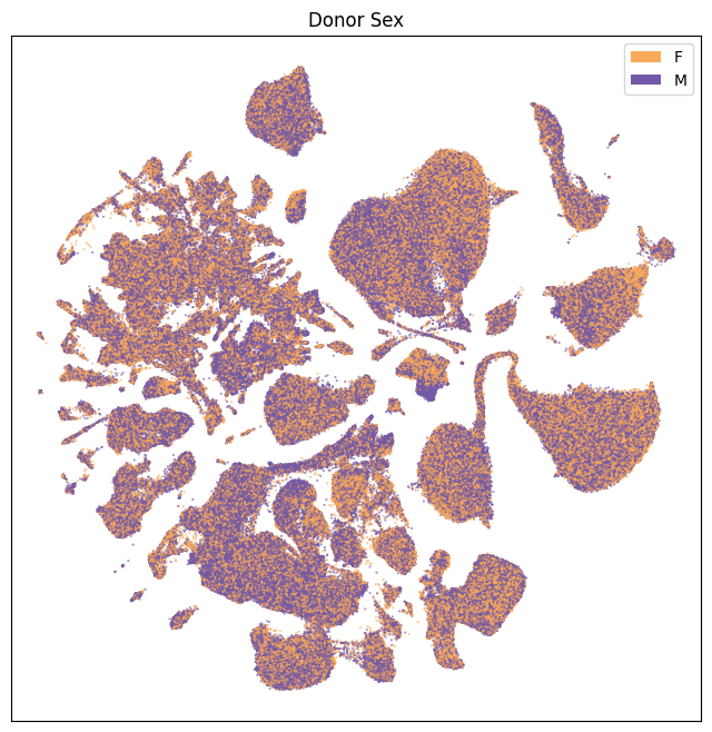
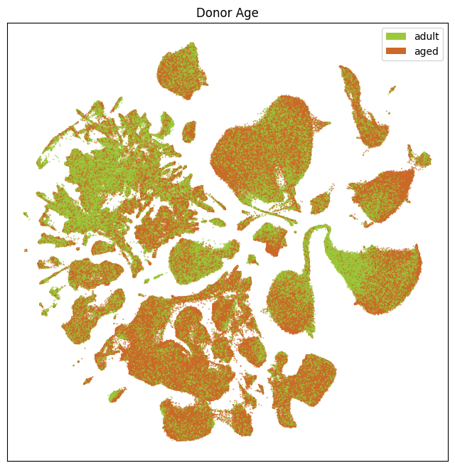
Now that we’ve merged the color information into the main cells data, we can plot the Uniform Manifold Approximation and Projection (UMAP) for all the cells in the dataset. The UMAP is a dimension reduction technique that can be used for visualizing and exploring large-dimension datasets. The x and y columns of the cell metadata table represent the coordinate of all cells in the UMAP in Figure 1 of the manuscript.
We define a small helper function plot umap to visualize the cells on the UMAP. In this example will plot associated cell information colorized by dissection region of interest, neurotransmitter identity, sex, taxonomy level, age category, and age depletion/enrichment.
def plot_umap(xx, yy, cc=None, val=None, fig_width=8, fig_height=8, cmap=None, labels=None):

    fig, ax = plt.subplots()
    fig.set_size_inches(fig_width, fig_height)

    if cmap is not None:
        scatt = ax.scatter(xx, yy, c=val, s=0.5, marker='.', cmap=cmap)
    elif cc is not None:
        scatt = ax.scatter(xx, yy, c=cc, s=0.5, marker='.')

    if labels is not None:
        from matplotlib.patches import Rectangle
        unique_colors = cc.unique()
        rects = []
        for color in unique_colors:
            rects.append(Rectangle((0, 0), 1, 1, fc=color))

        legend = ax.legend(rects, labels, loc=0)
        # ax.add_artist(legend)

    ax.axis('equal')
    ax.set_xticks([])
    ax.set_yticks([])

    return fig, ax
Below we plot the UMAPS for each of anatomical division, dissection, sex, and age.
fig, ax = plot_umap(
    cell_extended['x'],
    cell_extended['y'],
    cc=cell_extended['anatomical_division_color'],
    labels=cell_extended['anatomical_division_label'].unique()
)
res = ax.set_title("Anatomical Division")
plt.show()
fig, ax = plot_umap(
    cell_extended['x'],
    cell_extended['y'],
    cc=cell_extended['region_of_interest_color']
)
res = ax.set_title("Dissection Region Of Interest")
plt.show()
fig, ax = plot_umap(
    cell_extended['x'],
    cell_extended['y'],
    cc=cell_extended['donor_sex_color'],
    labels=cell_extended['donor_sex'].unique()
)
res = ax.set_title("Donor Sex")
plt.show()
fig, ax = plot_umap(
    cell_extended['x'],
    cell_extended['y'],
    cc=cell_extended['donor_age_category_color'],
    labels=cell_extended['donor_age_category'].unique()
)
res = ax.set_title("Donor Age")
plt.show()
Cluster Metadata#
We load information on the individual clusters including the age ratio, odds, and neurotransmitter information. This metadata is indexed on cluster_alias which is also a column in the cell_metadata that allows us to merge the information into that DataFrame.
cluster_info = abc_cache.get_metadata_dataframe(
    directory='Zeng-Aging-Mouse-10Xv3',
    file_name='cluster'
).set_index('cluster_alias')
cluster_info.head()
| number_of_cells | cluster_label | cluster_order | cluster_name | cluster_color | max_region_of_interest_label | proportion_max_region_of_interest_label | number_of_adult_cells | number_of_aged_cells | proportion_adult_cells | proportion_aged_cells | odds_ratio | log2_odds_ratio | cluster_age_bias | max_region_of_interest_color | cluster_age_bias_color | neurotransmitter_combined_label | neurotransmitter_label | neurotransmitter_color | |
|---|---|---|---|---|---|---|---|---|---|---|---|---|---|---|---|---|---|---|---|
| cluster_alias | |||||||||||||||||||
| 1 | 851 | CS20241021_0001 | 0 | 1_CLA-EPd-CTX Car3 Glut_1 | #f7c27a | Isocortex - AI | 0.831962 | 183 | 668 | 0.215041 | 0.784959 | 1.453797 | 0.539826 | unassigned | #219866 | #DADEDF | Glut | Glut | #2B93DF |
| 2 | 330 | CS20241021_0002 | 1 | 2_IT EP-CLA Glut_1 | #5c1a34 | Isocortex - AI | 0.969697 | 160 | 170 | 0.484848 | 0.515152 | 0.421595 | -1.246071 | unassigned | #219866 | #DADEDF | Glut | Glut | #2B93DF |
| 3 | 589 | CS20241021_0003 | 2 | 3_IT EP-CLA Glut_1 | #b96cf0 | Isocortex - AI | 0.894737 | 240 | 349 | 0.407470 | 0.592530 | 0.576896 | -0.793616 | unassigned | #219866 | #DADEDF | Glut | Glut | #2B93DF |
| 4 | 207 | CS20241021_0004 | 3 | 4_IT EP-CLA Glut_1 | #bff691 | Isocortex - AI | 0.971014 | 107 | 100 | 0.516908 | 0.483092 | 0.371035 | -1.430373 | unassigned | #219866 | #DADEDF | Glut | Glut | #2B93DF |
| 5 | 2141 | CS20241021_0005 | 4 | 5_IT EP-CLA Glut_1 | #39fbfa | Isocortex - AI | 0.987389 | 655 | 1486 | 0.305932 | 0.694068 | 0.900735 | -0.150825 | unassigned | #219866 | #DADEDF | Glut | Glut | #2B93DF |
Now that we have our data loaded and indexed, we can merge the tables together to create a single DataFrame allowing us to plot various information onto the UMAP and beyond.
# Join the cluster information in by joining on the Aging dataset's cluster_alias column.
cell_extended = cell_extended.join(cluster_info, on='cluster_alias', rsuffix='_cl_info')
cell_extended.head()
| cell_barcode | gene_count | umi_count | doublet_score | x | y | cluster_alias | cell_in_wmb_study | wmb_cluster_alias | library_label | ... | proportion_adult_cells | proportion_aged_cells | odds_ratio | log2_odds_ratio | cluster_age_bias | max_region_of_interest_color | cluster_age_bias_color | neurotransmitter_combined_label | neurotransmitter_label | neurotransmitter_color | |
|---|---|---|---|---|---|---|---|---|---|---|---|---|---|---|---|---|---|---|---|---|---|
| cell_label | |||||||||||||||||||||
| GCCTGTTGTGAATTAG-135_B01 | GCCTGTTGTGAATTAG | 6777 | 37834.0 | 0.200000 | -1.185296 | 1.881103 | 278 | True | 1079 | L8TX_190716_01_D07 | ... | 0.577949 | 0.422051 | 1.013716 | 0.019653 | unassigned | #80CDF8 | #DADEDF | GABA | GABA | #FF3358 |
| TCCGAAAGTGAAGCGT-761_A04 | TCCGAAAGTGAAGCGT | 3396 | 9585.0 | 0.030303 | 14.007499 | -0.220336 | 817 | False | <NA> | L8TX_210805_01_H01 | ... | 0.454494 | 0.545506 | 1.046448 | 0.065500 | unassigned | #8599CC | #DADEDF | No-NT | No-NT | #666666 |
| TTACCATGTCGTGGTC-327_A06 | TTACCATGTCGTGGTC | 4294 | 10527.0 | 0.020000 | 6.550781 | -1.378886 | 804 | False | <NA> | L8TX_200813_01_H10 | ... | 0.370570 | 0.629430 | 1.741208 | 0.800089 | unassigned | #80C0E2 | #DADEDF | No-NT | No-NT | #666666 |
| ACGGGTCGTACGAGCA-385_D06 | ACGGGTCGTACGAGCA | 2943 | 6957.0 | 0.000000 | 13.650183 | 0.289086 | 817 | False | <NA> | L8TX_201008_01_A12 | ... | 0.454494 | 0.545506 | 1.046448 | 0.065500 | unassigned | #8599CC | #DADEDF | No-NT | No-NT | #666666 |
| CTTAGGATCTGTCCCA-301_B04 | CTTAGGATCTGTCCCA | 7907 | 47406.0 | 0.037037 | 6.583878 | -10.639808 | 152 | False | <NA> | L8TX_200723_01_B10 | ... | 0.403409 | 0.596591 | 0.587232 | -0.767999 | unassigned | #72D569 | #DADEDF | Glut | Glut | #2B93DF |
5 rows × 54 columns
UMAP: Taxonomy information#
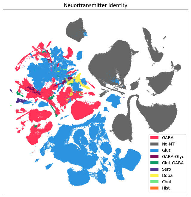
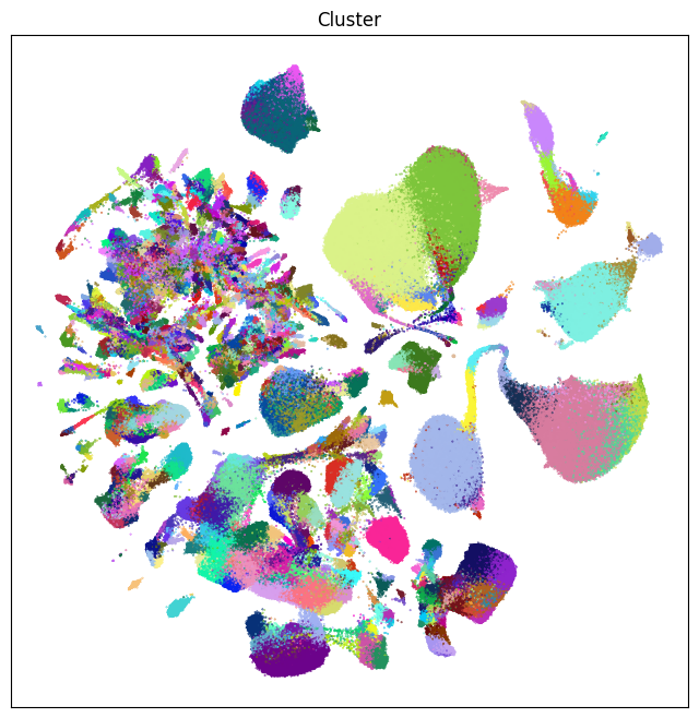
Below are UMAPs for labels associated with the taxonomy, namely: neurotransmitter and cluster. Note that the colors for neurotransmitter (and for class, subclass, and supertype) are the same as those from the WMB taxonomy.
fig, ax = plot_umap(
    cell_extended['x'],
    cell_extended['y'],
    cc=cell_extended['neurotransmitter_color'],
    labels=cell_extended['neurotransmitter_label'].unique()
)
res = ax.set_title("Neuortransmitter Identity")
plt.show()
fig, ax = plot_umap(cell_extended['x'], cell_extended['y'], cc=cell_extended['cluster_color'])
res = ax.set_title("Cluster")
plt.show()
Aging information#
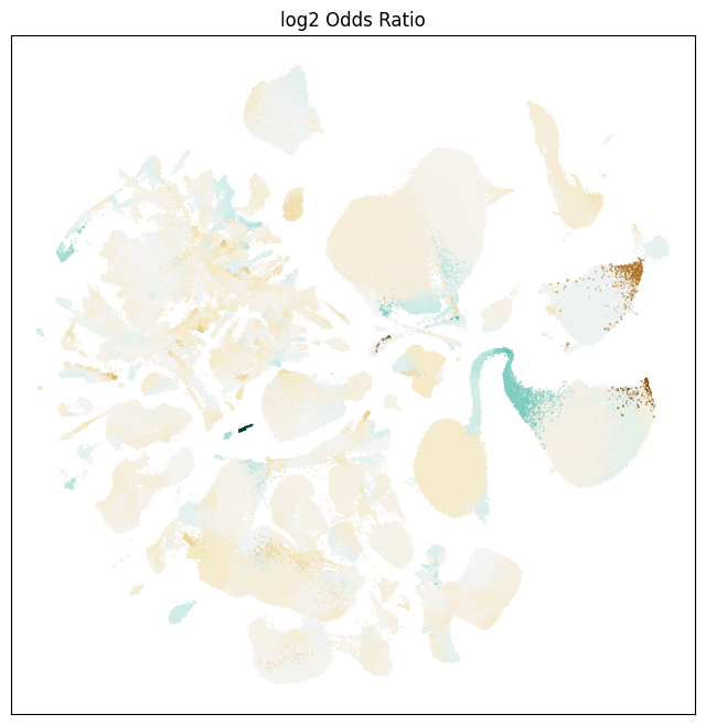
We plot aging related information on our UMAP, showing the different age-related variables and they are expressed in different locations of the UMAP. Below we show the location of the cells from the adult and aged mice.
Next, we show the log of the cluster level odds ratio for a given cluster to be age enriched (brown) or depleted (blue-green).
fig, ax = plot_umap(
    cell_extended['x'],
    cell_extended['y'],
    val=cell_extended['log2_odds_ratio'],
    cmap='BrBG_r'
)
res = ax.set_title("log2 Odds Ratio")
plt.show()
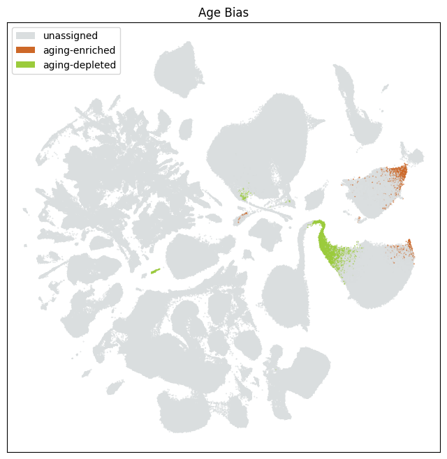
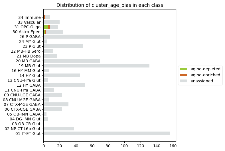
Finally, we show the clusters that are identified as aging-enriched and aging-depleted based on their odds ratio. (-2.5 > log2_odds_ratio, log2_odds_ratio > 2.5).
fig, ax = plot_umap(
    cell_extended['x'],
    cell_extended['y'],
    cc=cell_extended['cluster_age_bias_color'],
    labels=cell_extended['cluster_age_bias'].unique()
)
res = ax.set_title("Age Bias")
plt.show()
Taxonomy Mapping#
The following metadata maps all cells to the clusters and above levels in the taxonomy hierarchy. This includes all names and colors for each part of the taxonomy. As show in the above cluster tutorial for this dataset, each cluster in the Aging Dataset is nested within a supertype from the WMB dataset allowing one to walk all the way up to the class level.
cell_cluster_mapping = abc_cache.get_metadata_dataframe(
    directory='Zeng-Aging-Mouse-WMB-taxonomy',
    file_name='cell_cluster_mapping_annotations'
).set_index('cell_label')
cell_cluster_mapping.head()
| cluster_alias | cluster_label | cluster_order | cluster_name | cluster_color | class_name | subclass_name | supertype_name | class_color | subclass_color | supertype_color | |
|---|---|---|---|---|---|---|---|---|---|---|---|
| cell_label | |||||||||||
| AAACCCAAGGACACTG-367_B04 | 273 | CS20241021_0273 | 272 | 273_STR D1 Gaba_8 | #669ff8 | 09 CNU-LGE GABA | 061 STR D1 Gaba | 0272 STR D1 Gaba_8 | #B199FF | #005B66 | #660F13 |
| AAACCCAAGTAAACGT-367_B04 | 787 | CS20241021_0787 | 786 | 787_Astro-TE NN_3 | #daf288 | 30 Astro-Epen | 319 Astro-TE NN | 1163 Astro-TE NN_3 | #594a26 | #3DCCB1 | #a8afa5 |
| AAACCCACATTGAGCT-367_B04 | 833 | CS20241021_0833 | 832 | 833_Endo NN_1 | #096577 | 33 Vascular | 333 Endo NN | 1193 Endo NN_1 | #858881 | #994567 | #00992A |
| AAACGAAAGCCGTAAG-367_B04 | 787 | CS20241021_0787 | 786 | 787_Astro-TE NN_3 | #daf288 | 30 Astro-Epen | 319 Astro-TE NN | 1163 Astro-TE NN_3 | #594a26 | #3DCCB1 | #a8afa5 |
| AAACGAAAGCTACAAA-367_B04 | 815 | CS20241021_0815 | 814 | 815_MOL NN_4 | #c4dd47 | 31 OPC-Oligo | 327 Oligo NN | 1184 MOL NN_4 | #03045E | #99FFBC | #99CAFF |
cell_extended = cell_extended.join(cell_cluster_mapping, rsuffix='_cl_map')

# Quick run through to drop duplicated columns
drop_cols = []
for col in cell_extended.columns:
    if col.endswith(('_cl_map', '_cl_colors', '_cl_info')):
        drop_cols.append(col)
cell_extended.drop(columns=drop_cols, inplace=True)
Let’s take a look at what columns and data are in our final combined DataFrame before our final UMAP plots.
print_column_info(cell_extended)
Number of unique cell_barcode = 997258
Number of unique gene_count = 9838
Number of unique umi_count = 81632
Number of unique doublet_score = 874
Number of unique x = 1147449
Number of unique y = 1147537
Number of unique cluster_alias = 847
Number of unique cell_in_wmb_study = 2 [False, True]
Number of unique wmb_cluster_alias = 2656
Number of unique library_label = 287
Number of unique alignment_job_id = 287
Number of unique library_method = 2 ['10Xv3', '10xV3.1']
Number of unique barcoded_cell_sample_label = 287
Number of unique enrichment_population = 6 ['Calcein-positive, Hoechst-positive', 'Hoechst-positive', 'No FACS', 'RFP-positive, Calcein-positive, Hoechst-positive', 'RFP-positive, DAPI-negative', 'RFP-positive, Hoechst-positive']
Number of unique region_of_interest_label = 16 ['HPF - ENT', 'HPF - HIP', 'HPF - PAR-POST-PRE-SUB-ProS', 'HY - HY', 'Iscortex  - ACA', 'Isocortex  - AI', 'Isocortex - PL-ILA-ORB', 'Isocortex - RSP', 'MB - PAG-RAmb', 'MB - VTA-SN', 'P - Pmot/sat-ant', 'P - Pmot/sat-post', 'PAL - PAL', 'STR - STRd', 'STR - STRv', 'STR - sAMY']
Number of unique anatomical_division_label = 7 ['HPF', 'HY', 'Isocortex', 'MB', 'P', 'PAL', 'STR']
Number of unique library_in_wmb_study = 2 [False, True]
Number of unique donor_label = 108
Number of unique population_sampling = 2 ['Snap25+ neurons', 'unbiased']
Number of unique donor_genotype = 3 ['Ai14(RCL-tdT)/wt', 'Snap25-IRES2-Cre/wt;Ai14(RCL-tdT)/wt', 'wt/wt']
Number of unique donor_sex = 2 ['F', 'M']
Number of unique donor_age = 30
Number of unique donor_age_category = 2 ['adult', 'aged']
Number of unique donor_in_wmb_study = 2 [False, True]
Number of unique feature_matrix_label = 1 ['Zeng-Aging-Mouse-10Xv3']
Number of unique dataset_label = 1 ['Zeng-Aging-Mouse-10Xv3']
Number of unique abc_sample_id = 1162565
Number of unique anatomical_division_color = 7 ['#70FF71', '#7ED04B', '#8599CC', '#98D6F9', '#E64438', '#FF64FF', '#FF9B88']
Number of unique anatomical_division_order = 7 [0, 1, 2, 3, 4, 5, 6]
Number of unique donor_age_category_color = 2 ['#9ACA3C', '#CC6828']
Number of unique donor_age_category_order = 2 [0, 1]
Number of unique donor_sex_color = 2 ['#735AA6', '#FAAA5B']
Number of unique donor_sex_order = 2 [0, 1]
Number of unique region_of_interest_color = 15 ['#1AA698', '#219866', '#2FA850', '#32B825', '#40A666', '#72D569', '#7ED04B', '#80C0E2', '#80CDF8', '#8599CC', '#98D6F9', '#E64438', '#FF90FF', '#FFAE6F', '#FFC395']
Number of unique region_of_interest_order = 16 [0, 1, 2, 3, 4, 5, 6, 7, 8, 9, 10, 11, 12, 13, 14, 15]
Number of unique number_of_cells = 502
Number of unique cluster_label = 847
Number of unique cluster_order = 847
Number of unique cluster_name = 847
Number of unique cluster_color = 847
Number of unique max_region_of_interest_label = 16 ['HPF - ENT', 'HPF - HIP', 'HPF - PAR-POST-PRE-SUB-ProS', 'HY - HY', 'Iscortex  - ACA', 'Isocortex  - AI', 'Isocortex - PL-ILA-ORB', 'Isocortex - RSP', 'MB - PAG-RAmb', 'MB - VTA-SN', 'P - Pmot/sat-ant', 'P - Pmot/sat-post', 'PAL - PAL', 'STR - STRd', 'STR - STRv', 'STR - sAMY']
Number of unique proportion_max_region_of_interest_label = 681
Number of unique number_of_adult_cells = 395
Number of unique number_of_aged_cells = 416
Number of unique proportion_adult_cells = 823
Number of unique proportion_aged_cells = 823
Number of unique odds_ratio = 846
Number of unique log2_odds_ratio = 846
Number of unique cluster_age_bias = 3 ['aging-depleted', 'aging-enriched', 'unassigned']
Number of unique max_region_of_interest_color = 15 ['#1AA698', '#219866', '#2FA850', '#32B825', '#40A666', '#72D569', '#7ED04B', '#80C0E2', '#80CDF8', '#8599CC', '#98D6F9', '#E64438', '#FF90FF', '#FFAE6F', '#FFC395']
Number of unique cluster_age_bias_color = 3 ['#9BCB3C', '#CD6828', '#DADEDF']
Number of unique neurotransmitter_combined_label = 15 ['GABA', 'GABA-Chol', 'GABA-Dopa', 'GABA-Glyc', 'GABA-Hist', 'GABA-Sero', 'Glut', 'Glut-Chol', 'Glut-Dopa', 'Glut-GABA', 'Glut-GABA-Dopa', 'Glut-GABA-Glyc', 'Glut-GABA-Sero', 'Glut-Sero', 'No-NT']
Number of unique neurotransmitter_label = 9 ['Chol', 'Dopa', 'GABA', 'GABA-Glyc', 'Glut', 'Glut-GABA', 'Hist', 'No-NT', 'Sero']
Number of unique neurotransmitter_color = 9 ['#0a9964', '#2B93DF', '#533691', '#666666', '#73E785', '#820e57', '#FF3358', '#fcf04b', '#ff7621']
Number of unique class_name = 25 ['01 IT-ET Glut', '02 NP-CT-L6b Glut', '03 OB-CR Glut', '04 DG-IMN Glut', '05 OB-IMN GABA', '06 CTX-CGE GABA', '07 CTX-MGE GABA', '08 CNU-MGE GABA', '09 CNU-LGE GABA', '11 CNU-HYa GABA', '12 HY GABA', '13 CNU-HYa Glut', '14 HY Glut', '16 HY MM Glut', '19 MB Glut', '20 MB GABA', '21 MB Dopa', '22 MB-HB Sero', '23 P Glut', '24 MY Glut', '26 P GABA', '30 Astro-Epen', '31 OPC-Oligo', '33 Vascular', '34 Immune']
Number of unique subclass_name = 172
Number of unique supertype_name = 432
Number of unique class_color = 25 ['#007200', '#01d669', '#03045E', '#16f2f2', '#1b4332', '#38B000', '#450099', '#594a26', '#61e2a4', '#6b5ca5', '#70E000', '#72195a', '#825f45', '#858881', '#90E0EF', '#9EF01A', '#AA0DFE', '#B199FF', '#CCFF33', '#D00000', '#EC4067', '#F0A0FF', '#FA0087', '#FF6600', '#f954ee']
Number of unique subclass_color = 172
Number of unique supertype_color = 432
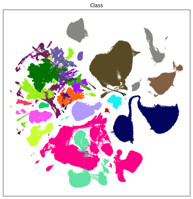
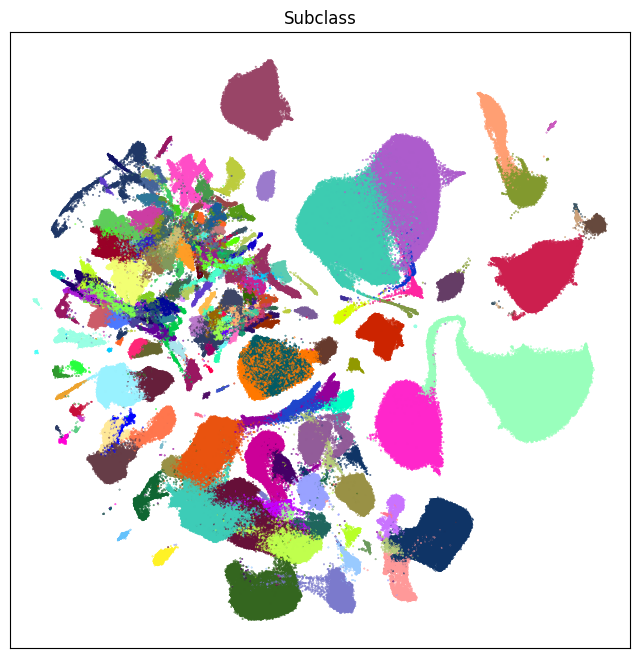
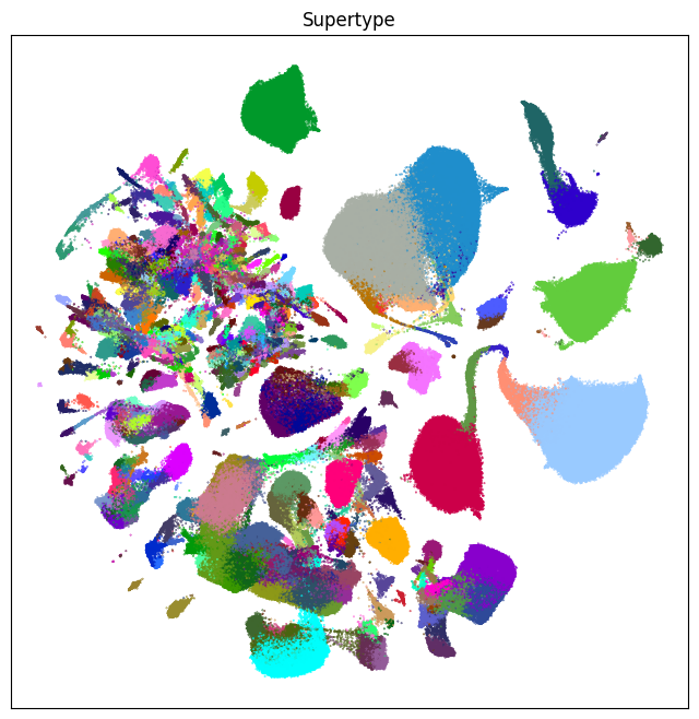
Now that the information on the WMB taxonomy has been merged into our cell metadata, we plot them here. Note again that the colors here are the same as those in WMB.
fig, ax = plot_umap(cell_extended['x'], cell_extended['y'], cc=cell_extended['class_color'])
res = ax.set_title("Class")
plt.show()
fig, ax = plot_umap(cell_extended['x'], cell_extended['y'], cc=cell_extended['subclass_color'])
res = ax.set_title("Subclass")
plt.show()
fig, ax = plot_umap(cell_extended['x'], cell_extended['y'], cc=cell_extended['supertype_color'])
res = ax.set_title("Supertype")
plt.show()
Aggregating cluster and cells counts per term#
Finally in this walkthrough of the data, we’ll explore the taxonomy a bit more.
Now that we have information associated in each cluster and the full hierarchy of the taxonomy loaded, we can merge the cluster_info and cell mapping tables on their index (cluster_alias), producing a dataset describing the taxonomy. We’ll use this to display counts of cells and clusters against various metadata.
We’ll need to load one more metadata containing the full mapping of Aging Mouse cluster to the WMB taxonomy.
cluster_mapping = abc_cache.get_metadata_dataframe(
    directory='Zeng-Aging-Mouse-WMB-taxonomy',
    file_name='cluster_mapping',
    dtype={'cluster_label': str}
).set_index('cluster_alias')
cluster_mapping.head()
cluster_mapping.csv: 100%|██████████| 405k/405k [00:00<00:00, 1.74MMB/s]
| cluster_label | cluster_order | cluster_name | cluster_color | cluster_annotation_term_label | cluster_annotation_term_name | cluster_annotation_term_set_label | parent_term_label | parent_term_set_label | term_set_order | term_order | cluster_annotation_term_set_name | color_hex_triplet | |
|---|---|---|---|---|---|---|---|---|---|---|---|---|---|
| cluster_alias | |||||||||||||
| 1 | CS20241021_0001 | 0 | 1_CLA-EPd-CTX Car3 Glut_1 | #f7c27a | CS20230722_SUPT_0001 | 0001 CLA-EPd-CTX Car3 Glut_1 | CCN20230722_SUPT | CS20230722_SUBC_001 | CCN20230722_SUBC | 3 | 0 | supertype | #99822E |
| 2 | CS20241021_0002 | 1 | 2_IT EP-CLA Glut_1 | #5c1a34 | CS20230722_SUPT_0003 | 0003 IT EP-CLA Glut_1 | CCN20230722_SUPT | CS20230722_SUBC_002 | CCN20230722_SUBC | 3 | 2 | supertype | #994563 |
| 3 | CS20241021_0003 | 2 | 3_IT EP-CLA Glut_1 | #b96cf0 | CS20230722_SUPT_0003 | 0003 IT EP-CLA Glut_1 | CCN20230722_SUPT | CS20230722_SUBC_002 | CCN20230722_SUBC | 3 | 2 | supertype | #994563 |
| 4 | CS20241021_0004 | 3 | 4_IT EP-CLA Glut_1 | #bff691 | CS20230722_SUPT_0003 | 0003 IT EP-CLA Glut_1 | CCN20230722_SUPT | CS20230722_SUBC_002 | CCN20230722_SUBC | 3 | 2 | supertype | #994563 |
| 5 | CS20241021_0005 | 4 | 5_IT EP-CLA Glut_1 | #39fbfa | CS20230722_SUPT_0003 | 0003 IT EP-CLA Glut_1 | CCN20230722_SUPT | CS20230722_SUBC_002 | CCN20230722_SUBC | 3 | 2 | supertype | #994563 |
Merge in cluster info to get the full set of colors and neurotransmitter identities.
membership = cluster_mapping.join(cluster_info, rsuffix='_cl_info')
membership.head()
| cluster_label | cluster_order | cluster_name | cluster_color | cluster_annotation_term_label | cluster_annotation_term_name | cluster_annotation_term_set_label | parent_term_label | parent_term_set_label | term_set_order | ... | proportion_adult_cells | proportion_aged_cells | odds_ratio | log2_odds_ratio | cluster_age_bias | max_region_of_interest_color | cluster_age_bias_color | neurotransmitter_combined_label | neurotransmitter_label | neurotransmitter_color | |
|---|---|---|---|---|---|---|---|---|---|---|---|---|---|---|---|---|---|---|---|---|---|
| cluster_alias | |||||||||||||||||||||
| 1 | CS20241021_0001 | 0 | 1_CLA-EPd-CTX Car3 Glut_1 | #f7c27a | CS20230722_SUPT_0001 | 0001 CLA-EPd-CTX Car3 Glut_1 | CCN20230722_SUPT | CS20230722_SUBC_001 | CCN20230722_SUBC | 3 | ... | 0.215041 | 0.784959 | 1.453797 | 0.539826 | unassigned | #219866 | #DADEDF | Glut | Glut | #2B93DF |
| 2 | CS20241021_0002 | 1 | 2_IT EP-CLA Glut_1 | #5c1a34 | CS20230722_SUPT_0003 | 0003 IT EP-CLA Glut_1 | CCN20230722_SUPT | CS20230722_SUBC_002 | CCN20230722_SUBC | 3 | ... | 0.484848 | 0.515152 | 0.421595 | -1.246071 | unassigned | #219866 | #DADEDF | Glut | Glut | #2B93DF |
| 3 | CS20241021_0003 | 2 | 3_IT EP-CLA Glut_1 | #b96cf0 | CS20230722_SUPT_0003 | 0003 IT EP-CLA Glut_1 | CCN20230722_SUPT | CS20230722_SUBC_002 | CCN20230722_SUBC | 3 | ... | 0.407470 | 0.592530 | 0.576896 | -0.793616 | unassigned | #219866 | #DADEDF | Glut | Glut | #2B93DF |
| 4 | CS20241021_0004 | 3 | 4_IT EP-CLA Glut_1 | #bff691 | CS20230722_SUPT_0003 | 0003 IT EP-CLA Glut_1 | CCN20230722_SUPT | CS20230722_SUBC_002 | CCN20230722_SUBC | 3 | ... | 0.516908 | 0.483092 | 0.371035 | -1.430373 | unassigned | #219866 | #DADEDF | Glut | Glut | #2B93DF |
| 5 | CS20241021_0005 | 4 | 5_IT EP-CLA Glut_1 | #39fbfa | CS20230722_SUPT_0003 | 0003 IT EP-CLA Glut_1 | CCN20230722_SUPT | CS20230722_SUBC_002 | CCN20230722_SUBC | 3 | ... | 0.305932 | 0.694068 | 0.900735 | -0.150825 | unassigned | #219866 | #DADEDF | Glut | Glut | #2B93DF |
5 rows × 32 columns
One final set of data to create is to calculate the number of clusters that are members of a given supertype, subclass, and class in the taxonomy.
# Count the number of clusters associated with each cluster annotation term
term_cluster_count = membership.groupby(['cluster_annotation_term_label'])[['cluster_label']].count()
term_cluster_count.columns = ['number_of_clusters']
term_cluster_count.head()
| number_of_clusters | |
|---|---|
| cluster_annotation_term_label | |
| CS20230722_CLAS_01 | 156 |
| CS20230722_CLAS_02 | 38 |
| CS20230722_CLAS_03 | 1 |
| CS20230722_CLAS_04 | 6 |
| CS20230722_CLAS_05 | 4 |
term_by_label = membership.set_index('cluster_annotation_term_label')
term_with_counts = term_by_label.join(term_cluster_count)
term_with_counts.head()
| cluster_label | cluster_order | cluster_name | cluster_color | cluster_annotation_term_name | cluster_annotation_term_set_label | parent_term_label | parent_term_set_label | term_set_order | term_order | ... | proportion_aged_cells | odds_ratio | log2_odds_ratio | cluster_age_bias | max_region_of_interest_color | cluster_age_bias_color | neurotransmitter_combined_label | neurotransmitter_label | neurotransmitter_color | number_of_clusters | |
|---|---|---|---|---|---|---|---|---|---|---|---|---|---|---|---|---|---|---|---|---|---|
| cluster_annotation_term_label | |||||||||||||||||||||
| CS20230722_SUPT_0001 | CS20241021_0001 | 0 | 1_CLA-EPd-CTX Car3 Glut_1 | #f7c27a | 0001 CLA-EPd-CTX Car3 Glut_1 | CCN20230722_SUPT | CS20230722_SUBC_001 | CCN20230722_SUBC | 3 | 0 | ... | 0.784959 | 1.453797 | 0.539826 | unassigned | #219866 | #DADEDF | Glut | Glut | #2B93DF | 1 |
| CS20230722_SUPT_0003 | CS20241021_0002 | 1 | 2_IT EP-CLA Glut_1 | #5c1a34 | 0003 IT EP-CLA Glut_1 | CCN20230722_SUPT | CS20230722_SUBC_002 | CCN20230722_SUBC | 3 | 2 | ... | 0.515152 | 0.421595 | -1.246071 | unassigned | #219866 | #DADEDF | Glut | Glut | #2B93DF | 5 |
| CS20230722_SUPT_0003 | CS20241021_0003 | 2 | 3_IT EP-CLA Glut_1 | #b96cf0 | 0003 IT EP-CLA Glut_1 | CCN20230722_SUPT | CS20230722_SUBC_002 | CCN20230722_SUBC | 3 | 2 | ... | 0.592530 | 0.576896 | -0.793616 | unassigned | #219866 | #DADEDF | Glut | Glut | #2B93DF | 5 |
| CS20230722_SUPT_0003 | CS20241021_0004 | 3 | 4_IT EP-CLA Glut_1 | #bff691 | 0003 IT EP-CLA Glut_1 | CCN20230722_SUPT | CS20230722_SUBC_002 | CCN20230722_SUBC | 3 | 2 | ... | 0.483092 | 0.371035 | -1.430373 | unassigned | #219866 | #DADEDF | Glut | Glut | #2B93DF | 5 |
| CS20230722_SUPT_0003 | CS20241021_0005 | 4 | 5_IT EP-CLA Glut_1 | #39fbfa | 0003 IT EP-CLA Glut_1 | CCN20230722_SUPT | CS20230722_SUBC_002 | CCN20230722_SUBC | 3 | 2 | ... | 0.694068 | 0.900735 | -0.150825 | unassigned | #219866 | #DADEDF | Glut | Glut | #2B93DF | 5 |
5 rows × 32 columns
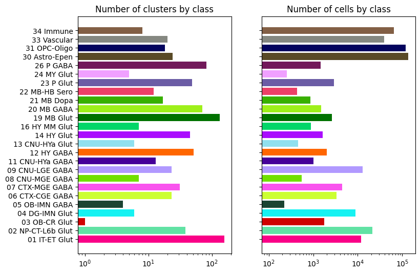
Let’s visualize cluster and cells counts for of the classification levels using bar plots.
def bar_plot_by_level_and_type(df, level=None, fig_width = 8.5, fig_height = 4):

    fig, ax = plt.subplots(1, 2)
    fig.set_size_inches(fig_width, fig_height)

    for idx, ctype in enumerate(['clusters', 'cells']):

        if level.lower().startswith('neurotransmitter'):
            level = 'Neurotransmitter'
            names = df['neurotransmitter_label']
            pred = np.ones(len(df), dtype=bool)
            colors = df['neurotransmitter_color']
            counts = df['number_of_%s' % ctype]
        else:
            pred = (df['cluster_annotation_term_set_name'] == level)
            names = df[pred]['cluster_annotation_term_name']
            colors = df[pred]['color_hex_triplet']
            counts = df[pred]['number_of_%s' % ctype]

        ax[idx].barh(names, counts, color=colors)
        ax[idx].set_title('Number of %s by %s' % (ctype, level)),
        ax[idx].set_xscale('log')

        if idx > 0 :
            ax[idx].set_yticklabels([])

    plt.show()
Neurotransmitter cluster and cell counts#
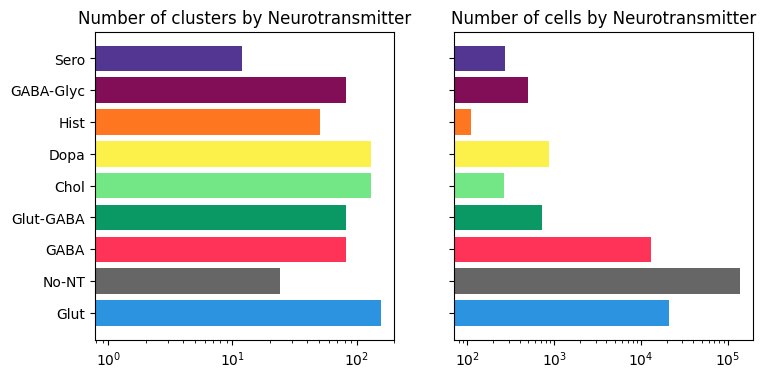
As seen below, most of the clusters in the study are glutamatergic, while the majority of cells are Nonneuronal.
bar_plot_by_level_and_type(term_with_counts, 'neurotransmitter_label')
Class level cluster and cell counts#
Class “01 IT-ET” contains the largest number of clusters (~100), while class “30 Astro-Epen” contains the largest number of cells.
bar_plot_by_level_and_type(term_with_counts, 'class', 8.5, 6)
Visualizing cluster and term distributions#
We can explore the relationship and distribution of clusters between term sets by creating a pivot table using pandas groupby function. Each row of the resulting DataFrame represents a cluster, each column represents a term set and the value in the table is the name of the term that has been associated with the cluster for that specific term set.
pivot = membership.groupby(['cluster_alias', 'cluster_annotation_term_set_name'])['cluster_annotation_term_name'].first().unstack()
pivot = pivot.join(cluster_info)
pivot.head()
| class | subclass | supertype | number_of_cells | cluster_label | cluster_order | cluster_name | cluster_color | max_region_of_interest_label | proportion_max_region_of_interest_label | ... | proportion_adult_cells | proportion_aged_cells | odds_ratio | log2_odds_ratio | cluster_age_bias | max_region_of_interest_color | cluster_age_bias_color | neurotransmitter_combined_label | neurotransmitter_label | neurotransmitter_color | |
|---|---|---|---|---|---|---|---|---|---|---|---|---|---|---|---|---|---|---|---|---|---|
| cluster_alias | |||||||||||||||||||||
| 1 | 01 IT-ET Glut | 001 CLA-EPd-CTX Car3 Glut | 0001 CLA-EPd-CTX Car3 Glut_1 | 851 | CS20241021_0001 | 0 | 1_CLA-EPd-CTX Car3 Glut_1 | #f7c27a | Isocortex - AI | 0.831962 | ... | 0.215041 | 0.784959 | 1.453797 | 0.539826 | unassigned | #219866 | #DADEDF | Glut | Glut | #2B93DF |
| 2 | 01 IT-ET Glut | 002 IT EP-CLA Glut | 0003 IT EP-CLA Glut_1 | 330 | CS20241021_0002 | 1 | 2_IT EP-CLA Glut_1 | #5c1a34 | Isocortex - AI | 0.969697 | ... | 0.484848 | 0.515152 | 0.421595 | -1.246071 | unassigned | #219866 | #DADEDF | Glut | Glut | #2B93DF |
| 3 | 01 IT-ET Glut | 002 IT EP-CLA Glut | 0003 IT EP-CLA Glut_1 | 589 | CS20241021_0003 | 2 | 3_IT EP-CLA Glut_1 | #b96cf0 | Isocortex - AI | 0.894737 | ... | 0.407470 | 0.592530 | 0.576896 | -0.793616 | unassigned | #219866 | #DADEDF | Glut | Glut | #2B93DF |
| 4 | 01 IT-ET Glut | 002 IT EP-CLA Glut | 0003 IT EP-CLA Glut_1 | 207 | CS20241021_0004 | 3 | 4_IT EP-CLA Glut_1 | #bff691 | Isocortex - AI | 0.971014 | ... | 0.516908 | 0.483092 | 0.371035 | -1.430373 | unassigned | #219866 | #DADEDF | Glut | Glut | #2B93DF |
| 5 | 01 IT-ET Glut | 002 IT EP-CLA Glut | 0003 IT EP-CLA Glut_1 | 2141 | CS20241021_0005 | 4 | 5_IT EP-CLA Glut_1 | #39fbfa | Isocortex - AI | 0.987389 | ... | 0.305932 | 0.694068 | 0.900735 | -0.150825 | unassigned | #219866 | #DADEDF | Glut | Glut | #2B93DF |
5 rows × 22 columns
We can also obtain a cluster annotation color pivot table in the same way.
color = membership.groupby(['cluster_alias', 'cluster_annotation_term_set_name'])['color_hex_triplet'].first().unstack().fillna('#f9f9f9')
color.columns = ['%s_color' % x for x in color.columns]
color.head()
| class_color | subclass_color | supertype_color | |
|---|---|---|---|
| cluster_alias | |||
| 1 | #FA0087 | #64c2fc | #99822E |
| 2 | #FA0087 | #1F665D | #994563 |
| 3 | #FA0087 | #1F665D | #994563 |
| 4 | #FA0087 | #1F665D | #994563 |
| 5 | #FA0087 | #1F665D | #994563 |
pivot = pivot.join(color)
Plotting distributions of clusters and cells by taxonomy level#
For a given pair of term sets A and B, we compute a cluster count table where the rows are terms in term set A, columns are terms in term set B with the table values being the number of clusters that are shared between the terms.
def distribution(A, B, B_color) :

    AxB = pivot.groupby([A, B])[['cluster_name']].count()
    AxB.columns = ['number_of_clusters']
    AxB = AxB.unstack().fillna(0)
    B_names = pivot[B].unique()
    B_colors = pd.Series(data=pivot[B_color].unique(), index=B_names)

    return AxB, B_names, B_colors
Function stacked_bar_distribution takes the results of distribution as input to create distribution stacked bar plot.
def stacked_bar_distribution(AxB, B_names, B_colors, fig_width = 6, fig_height = 6):
    """
    """

    fig, ax = plt.subplots()
    fig.set_size_inches(fig_width, fig_height)

    bottom = np.zeros(len(AxB))

    for i, col in enumerate(AxB.columns):
        ax.barh(AxB.index, AxB[col], left=bottom, label=col[1], color=B_colors.loc[col[1]])
        bottom += np.array(AxB[col])

    ax.set_title('Distribution of %s in each %s' % (AxB.columns.names[1], AxB.index.name))
    ax.legend(loc='center left', bbox_to_anchor=(1, 0.5))

    plt.show()

    return fig, ax
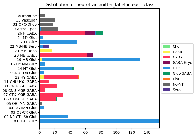
Distribution of neurotransmitter clusters in each class#
AxB, B_names, B_colors = distribution('class', 'neurotransmitter_label', 'neurotransmitter_color')
fig, ax = stacked_bar_distribution(AxB, B_names, B_colors, 6, 6)
Distribution of age enriched vs age depleted clusters#
AxB, B_names, B_colors = distribution('class', 'cluster_age_bias', 'cluster_age_bias_color')
fig, ax = stacked_bar_distribution(AxB, B_names, B_colors, 6, 6)
Distribution of adult and aged cells#
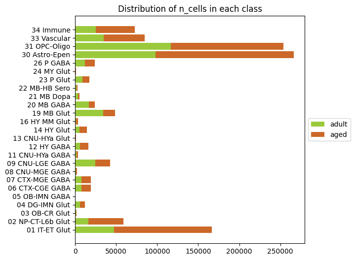
We can use the same groupby functionality as our distribution functions to this time sum up all the adult and age cells in each cluster and plot those versus class (or subclass, supertype). Note that there are ~600k aged cells vs ~400k adult cells in the data so an overall bias towards the aged cells is expected.
# Sum up the number of aged and adult cells.
n_adult = pivot.groupby(['class'])[['number_of_adult_cells']].sum()
n_aged = pivot.groupby(['class'])[['number_of_aged_cells']].sum()
adult_vs_aged = n_adult.join(n_aged)

# Rename columns and correctly label the aged/adult cells by color.
adult_vs_aged.columns = pd.MultiIndex.from_tuples(
    [('n_cells', 'adult'), ('n_cells', 'aged')],
    names=[None, 'n_cells'])
B_names = ['adult', 'aged']
B_colors = pd.Series(data=['#9ACA3C', '#CC6828'], index=B_names)

# Plot our barplot
fig, ax = stacked_bar_distribution(adult_vs_aged, B_names, B_colors, 6, 6)
Visualizing the mouse whole brain taxonomy#
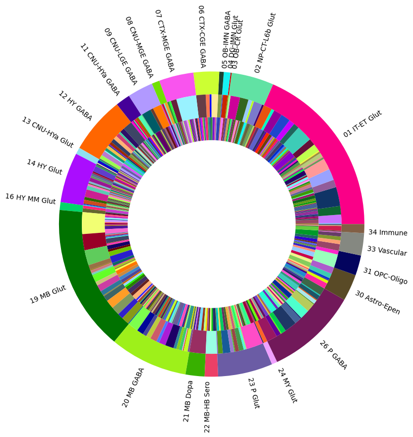
Term sets: class, subclass, supertype and cluster form a four-level mouse whole brain taxonomy. We can visualize the taxonomy as a sunburst diagram that shows the single inheritance hierarchy through a series of rings, that are sliced for each annotation term. Each ring corresponds to a level in the hierarchy. We have ordered the rings so that the class level is the outer most ring so that we can add in each class’s labels. Rings are sliced up and divided based on their hierarchical relationship to the parent slice. The angle of each slice is proportional to the number of clusters belonging to the term.
levels = ['class', 'subclass', 'supertype']
df = {}

for lvl in levels:
    pred = term_with_counts['cluster_annotation_term_set_name'] == lvl
    df[lvl] = term_with_counts[pred]
    df[lvl] = df[lvl].sort_values(['parent_term_label'])
    df[lvl] = df[lvl][~df[lvl].index.duplicated(keep='first')]

fig, ax = plt.subplots()
fig.set_size_inches(10, 10)
size = 0.15

for i, lvl in enumerate(levels):

    if lvl == 'class':
        ax.pie(df[lvl]['number_of_clusters'],
               colors=df[lvl]['color_hex_triplet'],
               labels=df[lvl]['cluster_annotation_term_name'],
               rotatelabels=True,
               labeldistance=1.025,
               radius=1,
               wedgeprops=dict(width=size, edgecolor=None),
               startangle=0)
    else:
        ax.pie(df[lvl]['number_of_clusters'],
               colors=df[lvl]['color_hex_triplet'],
               radius=1-i*size,
               wedgeprops=dict(width=size, edgecolor=None),
               startangle=0)

plt.show()
In part 2 we’ll focus on gene data including using the UMAP to plot gene expression locations as well as age Differential (ageDE) genes identified in Zeng et al.
