Visualizing Unit Quality Metrics#
Note: This content is taken and adapted from the Allen SDK Documentation. Further explanation for each metric can be found there.
All of the Allen Institute Neuropixels data has been sorted with Kilosort2, a template-matching algorithm developed by Marius Pachitariu at HHMI Janelia Research Campus [Pachitariu et al., 2016]. A unit in the context of spike-sorted electrophysiology data, is a putative neuron. Spike sorting techniques identify these units and attributes recorded spikes to each of them based on a number of properties of the raw electrical data from the probes.
Because there is no “ground truth” information available in these datasets, any sorting algorithm is bound to make mistakes. Quality metrics allow us to understand the types of mistakes that are occurring, and obtain an estimate of their severity. Some common errors that can be identified by quality metrics include:
Assigning spikes from multiple neurons to the same cluster
Missing spikes from neurons with waveform amplitude near the spike detection threshold
Failing to track neurons with waveforms that change as a result of electrode drift
These mistakes can occur even in units that appear to be extremely well isolated. It’s misleading to conceive of units as existing in two distinct categories, one with perfectly clean “single units” and one with impure “multiunits.” Instead, there’s a gradient of qualities, with mostly complete, uncontaminated units at one end, and incomplete, highly contaminated units at the other.
Despite the fact that there’s not a clear division between single-unit and multi-unit activity, we still have to make a binary decision in every analysis we carry out: should this unit be included or not? Ideally this decision should be based on objective metrics that will not bias the end results. By default, the AllenSDK uses three quality metrics, isi_violations, amplitude_cutoff, and presence_ratio, to filter out units that are likely to be highly contaminated or missing lots of spikes. However, the default values of these filters may not be appropriate for your analysis, or you may want to disable them entirely. Reading through this tutorial will give you a better understanding of how these (and other) metrics should be applied, so you can apply them effectively throughout your own explorations of this dataset.
This Jupyter notebook will provide a detailed explanation of the unit quality metrics included in ecephys NWB Files. It’s important to pay attention to quality metrics, because failing to apply them correctly could lead to invalid scientific conclusions, or could end up hiding potentially useful data. To help you avoid these pitfalls, this tutorial will explore how these metrics are calculated, how they can be biased, and how they should be applied to specific use cases. It’s important to keep in mind that none of these metrics are perfect, and that the use of unit quality metrics for filtering ephys data is still an evolving area of research. More work is required in order to establish general-purpose best practices and standards in this domain.
Environment Setup#
⚠️Note: If running on a new environment, run this cell once and then restart the kernel⚠️
import warnings
warnings.filterwarnings('ignore')

try:
    from databook_utils.dandi_utils import dandi_stream_open
except:
    !git clone https://github.com/AllenInstitute/openscope_databook.git
    %cd openscope_databook
    %pip install -e .
import matplotlib.pyplot as plt
import numpy as np

%matplotlib inline
Streaming Ecephys File#
The example file we use is from the Allen Institute’s Visual Coding - Neuropixels dataset. To specify your own file to use, set dandiset_id and dandi_filepath to be the respective dandiset id and dandi filepath of the file you’re interested in. When accessing an embargoed dataset, set dandi_api_key to be your DANDI API key.
dandiset_id = "000021"
dandi_filepath = "sub-703279277/sub-703279277_ses-719161530.nwb"
dandi_api_key = None
# This can sometimes take a while depending on the size of the file
io = dandi_stream_open(dandiset_id, dandi_filepath, dandi_api_key=dandi_api_key)
nwb = io.read()
Extracting Units Data#
Here we get the Units table from the NWB file. This table contains all the recorded information about each unit. Also printed are the column names for the table. Not all of these unit properties are relevant, but many of them will be discussed and distributions of them will be displayed.
units = nwb.units
units[:10]
| waveform_duration | cluster_id | peak_channel_id | cumulative_drift | amplitude_cutoff | snr | recovery_slope | isolation_distance | nn_miss_rate | silhouette_score | ... | local_index | spread | waveform_halfwidth | d_prime | presence_ratio | repolarization_slope | nn_hit_rate | spike_times | spike_amplitudes | waveform_mean | |
|---|---|---|---|---|---|---|---|---|---|---|---|---|---|---|---|---|---|---|---|---|---|
| id | |||||||||||||||||||||
| 950921187 | 0.604355 | 4 | 850249267 | 481.80 | 0.425574 | 2.209140 | -0.118430 | 17.537571 | 0.009496 | 0.036369 | ... | 4 | 50.0 | 0.357119 | 2.962274 | 0.99 | 0.381716 | 0.473829 | [1.0439430431793884, 1.543311060144649, 2.7287... | [0.0001908626967721937, 0.00016134635752077775... | [[0.0, 0.5961149999999966, 5.378099999999993, ... |
| 950921172 | 0.521943 | 3 | 850249267 | 681.53 | 0.390098 | 1.959983 | -0.109729 | 14.677643 | 0.003857 | 0.103446 | ... | 3 | 40.0 | 0.260972 | 2.067810 | 0.99 | 0.536663 | 0.445946 | [10.406435026164546, 17.127986534673788, 18.48... | [0.00014485615850768024, 0.0001722424107984555... | [[0.0, -1.341600000000002, -0.4586399999999933... |
| 950921152 | 0.467002 | 2 | 850249267 | 1070.71 | 0.500000 | 2.522905 | -0.109867 | 15.783665 | 0.017776 | 0.027818 | ... | 2 | 50.0 | 0.247236 | 2.220043 | 0.99 | 0.566559 | 0.284058 | [1.2775103414155262, 2.3915133536963493, 3.701... | [0.00014859435856024575, 0.0001531048673600236... | [[0.0, -0.6427199999999993, -2.836079999999998... |
| 950921135 | 0.467002 | 1 | 850249267 | 253.42 | 0.500000 | 2.803475 | -0.150379 | 26.666930 | 0.023742 | 0.076530 | ... | 1 | 40.0 | 0.233501 | 2.339206 | 0.99 | 0.669090 | 0.590737 | [9.473732504122962, 13.198542576065163, 18.302... | [0.00032386170367170055, 0.0004518112387675137... | [[0.0, -3.2800950000000078, -6.087510000000009... |
| 950921111 | 0.439531 | 0 | 850249267 | 141.82 | 0.018056 | 4.647943 | -0.328727 | 66.901065 | 0.006595 | NaN | ... | 0 | 30.0 | 0.219765 | 4.395994 | 0.99 | 1.261416 | 0.952667 | [1.1677100445138795, 1.1707767194728813, 1.349... | [0.00015644521007973124, 0.000214412247939483,... | [[0.0, -0.9291749999999945, -6.120270000000007... |
| 950927711 | 1.455946 | 482 | 850249273 | 2.46 | 0.000895 | 1.651500 | -0.039932 | 39.400278 | 0.000033 | NaN | ... | 464 | 100.0 | 0.274707 | 5.557479 | 0.37 | 0.467365 | 0.000000 | [2613.8652081509977, 2624.5193369599215, 2734.... | [0.00012946663895843286, 0.0001203425053985725... | [[0.0, 6.3216435986159105, 10.324204152249129,... |
| 950921285 | 2.087772 | 11 | 850249273 | 318.53 | 0.036848 | 1.379817 | NaN | 27.472722 | 0.000903 | 0.291953 | ... | 11 | 100.0 | 0.288442 | 2.751337 | 0.89 | 0.372116 | 0.258065 | [39.04904580954626, 39.457346913598556, 40.495... | [7.768399792002802e-05, 8.405736507197006e-05,... | [[0.0, 5.330324999999991, 2.4261899999999486, ... |
| 950921271 | 0.947739 | 10 | 850249273 | 1008.50 | 0.001727 | 1.420617 | -0.008204 | 30.027595 | 0.000707 | 0.406673 | ... | 10 | 100.0 | 0.288442 | 3.847234 | 0.96 | 0.498618 | 0.796491 | [16.751918851114475, 26.127977537450867, 28.65... | [0.00016516929470324686, 0.0001501058102103845... | [[0.0, -3.103230000000032, 5.680349999999983, ... |
| 950921260 | 0.453266 | 9 | 850249273 | 175.00 | 0.000081 | 4.969091 | -0.184456 | 89.804006 | 0.000000 | 0.223876 | ... | 9 | 60.0 | 0.192295 | 5.274090 | 0.99 | 1.140487 | 0.997333 | [0.9620761551434307, 2.092045877265143, 2.4040... | [0.0003836112198262231, 0.0004093908262843732,... | [[0.0, 1.9104149999999982, -7.270770000000016,... |
| 950921248 | 0.439531 | 8 | 850249273 | 261.11 | 0.065478 | 2.147758 | -0.085677 | 84.145512 | 0.005474 | 0.076346 | ... | 8 | 60.0 | 0.274707 | 3.022387 | 0.99 | 0.463570 | 0.976667 | [1.316477113448928, 1.779311698293908, 2.96088... | [0.00013780619334124896, 0.0001439873831056905... | [[0.0, -3.6761399999999953, 0.8334300000000014... |
10 rows × 29 columns
units.colnames
('waveform_duration',
 'cluster_id',
 'peak_channel_id',
 'cumulative_drift',
 'amplitude_cutoff',
 'snr',
 'recovery_slope',
 'isolation_distance',
 'nn_miss_rate',
 'silhouette_score',
 'velocity_above',
 'quality',
 'PT_ratio',
 'l_ratio',
 'velocity_below',
 'max_drift',
 'isi_violations',
 'firing_rate',
 'amplitude',
 'local_index',
 'spread',
 'waveform_halfwidth',
 'd_prime',
 'presence_ratio',
 'repolarization_slope',
 'nn_hit_rate',
 'spike_times',
 'spike_amplitudes',
 'waveform_mean')
Quality(“noise labels”)#
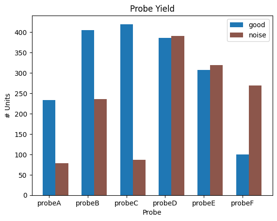
Prior to looking in-depth at unit metrics, we need to explain one categorical property in the units table–“quality”. Neither does this property necessarily mean the ground-truth qulaity results nor does it conclude of the unit metrics. In fact, it the result of one module–“noise_templates” in old Allen ecephys spike sorting pipeline. It can be “noise” or “good”, which is based on the classification of the waveforms and and ISI histogram. The “noise” units are ones that are suspected not to be actual neurons or to be poor quality recordings of one or more neurons because their waveforms don’t look like action potentials.
It is recommended that noise units are not analyzed. You can also combine this property together with some additional filtering criteria in the metrics.(In other notebooks, we often use the combined criteria in the function select_unit)some additional filtering criteria into one unified function Below, a plot is made that shows probe yield. That is, the number of units from each probe which are good and noisy.
Because probe information is not stored in the units table but stored in an indirect way within the NWB file, we have to do a bit of work with the Electrodes table to arrange the data. To understand this notebook, you need not be familiar with the Electrodes table except that it can be used to map channel ids to probe ids.
# map good and noise units to their related probe id using their "peak waveform channel"
electrodes = nwb.electrodes.to_dataframe()
probe_units = {}

for i in range(len(units)):
    # get probe id for unit from electrodes table
    peak_channel = units.peak_channel_id[i]
    probe = electrodes.loc[peak_channel].probe_id
    # mark if unit is good or noise
    if probe not in probe_units:
        probe_units[probe] = [0,0]
    if units.quality[i] == "good":
        probe_units[probe][0] += 1
    elif units.quality[i] == "noise":
        probe_units[probe][1] += 1

probe_units
{729445650: [405, 236],
 729445652: [420, 87],
 729445648: [233, 78],
 729445654: [386, 391],
 729445656: [308, 319],
 729445658: [100, 269]}
# map probe id to probe name
probe_names = {}
for probe_name in nwb.devices:
    if "probe" in probe_name:
        probe_id = nwb.devices[probe_name].probe_id
        probe_names[probe_id] = probe_name

probe_names
{729445648: 'probeA',
 729445650: 'probeB',
 729445652: 'probeC',
 729445654: 'probeD',
 729445656: 'probeE',
 729445658: 'probeF'}
fig, ax = plt.subplots()
labels = []
for i, probe_id in enumerate(probe_names):
    probe_name = probe_names[probe_id]
    good_units = probe_units[probe_id][0]
    noise_units = probe_units[probe_id][1]

    ax.bar(i, good_units, width=0.33, color="tab:blue")
    ax.bar(i+0.33, noise_units, width=0.33, color="tab:brown")

ax.set_xticks(np.arange(len(probe_names)))
ax.set_xticklabels(probe_names.values())
ax.legend(["good", "noise"])

ax.set_xlabel("Probe")
ax.set_ylabel("# Units")
ax.set_title("Probe Yield")
plt.show()
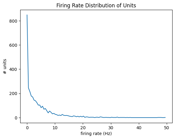
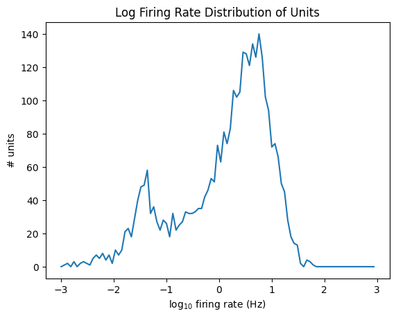
Firing Rate#
Firing rate is equal to the total number of spikes divided by the number of seconds in the recording. Below is a density plot of firing rate across all units in the dataset as well as a log-scaled version.
data = units['firing_rate']
bins = np.linspace(0,50,100)
hist, bin_edges = np.histogram(data, bins=bins)

fig, ax = plt.subplots()
ax.plot(bin_edges[:-1], hist)

plt.xlabel("firing rate (Hz)")
plt.ylabel("# units")
plt.title("Firing Rate Distribution of Units")
plt.show()
data = np.log10(units['firing_rate'])
bins = np.linspace(-3,3,100)
hist, bin_edges = np.histogram(data, bins=bins)

fig, ax = plt.subplots()
ax.plot(bin_edges[:-1], hist)

plt.xlabel("log$_{10}$ firing rate (Hz)")
plt.ylabel("# units")
plt.title("Log Firing Rate Distribution of Units")
plt.show()
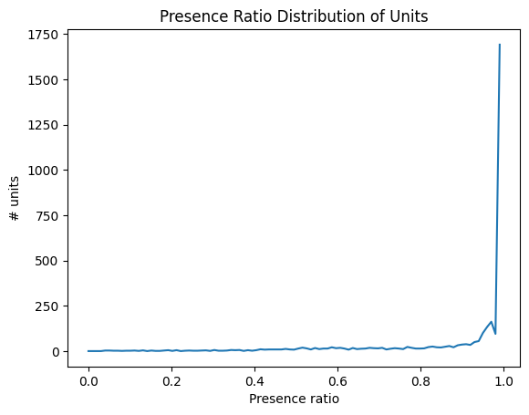
Presence Ratio#
Presence ratio measures the fraction of time during a session in which a unit is spiking, and ranges from 0 to 0.99. This can be helpful for detecting units that drift out of the recording during a session.
data = units['presence_ratio']
bins = np.linspace(0,1,100)
hist, bin_edges = np.histogram(data, bins=bins)

fig, ax = plt.subplots()
ax.plot(bin_edges[:-1], hist)

plt.xlabel("Presence ratio")
plt.ylabel("# units")
plt.title("Presence Ratio Distribution of Units")
plt.show()
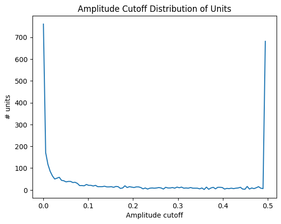
Amplitude Cutoff#
Amplitude cutoff is a way to check for units that are missing spikes. Unlike presence ratio, which can detect units that drift out of the recording, amplitude cutoff provides an estimate of the false negative rate—e.g., the fraction of spikes below the spike detection threshold. Thus, amplitude cutoff is a measure of unit “completeness” that is complementary to presence ratio. If the amplitude cutoff for a unit is high, it indicates that the unit was poorly detected, which could be due to drift. Below is a distribution of amplitude cutoffs for all the units.
data = units['amplitude_cutoff']
bins = np.linspace(0,0.5,100)
hist, bin_edges = np.histogram(data, bins=bins)

fig, ax = plt.subplots()
ax.plot(bin_edges[:-1], hist)

plt.xlabel("Amplitude cutoff")
plt.ylabel("# units")
plt.title("Amplitude Cutoff Distribution of Units")
plt.show()
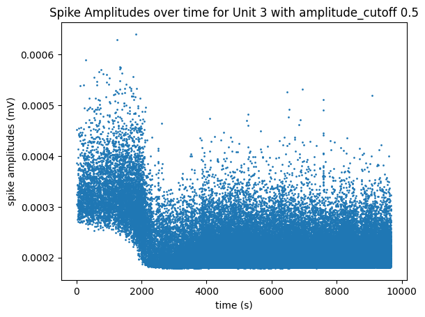
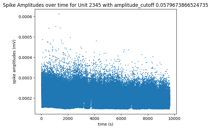
The plot below helps show the meaning of the amplitude cutoff for a unit by displaying the measured amplitudes of the unit’s spikes throughout the session. This plot can be a good way to illustrate unit drift; Units whose spike amplitudes suddenly change during a session are units that probably drifted farther or closer to the probe. When a unit’s spike amplitude trace spends a lot of time on the “floor” of the plot, it indicates that spikes are going undetected when the measured amplitudes get too low. The plot below of unit 3, with a high amplitude cutoff of 0.5, shows the unit drifting out of the recording until its measured amplitudes are too low and can’t always be detected around the 2000 seconds mark. The plot below that of unit 2348 has a very low amplitude cutoff, and it can be seen that it’s spikes stay at a consistent average amplitude over time and don’t spend any time at the “floor” of the plot.
unit_select = 3 # has a high amplitude_cutoff
fig, ax = plt.subplots()
data = units["spike_amplitudes"][unit_select]
xaxis = units["spike_times"][unit_select]
amplitude_cutoff = units["amplitude_cutoff"][unit_select]

ax.set_title(f"Spike Amplitudes over time for Unit {unit_select} with amplitude_cutoff {amplitude_cutoff}")
ax.set_xlabel("time (s)")
ax.set_ylabel("spike amplitudes (mV)")
ax.scatter(xaxis, data, s=1)
<matplotlib.collections.PathCollection at 0x21162fb4250>
unit_select = 2345 # very low amplitude_cutoff
fig, ax = plt.subplots()
data = units["spike_amplitudes"][unit_select]
xaxis = units["spike_times"][unit_select]
amplitude_cutoff = units["amplitude_cutoff"][unit_select]

ax.set_title(f"Spike Amplitudes over time for Unit {unit_select} with amplitude_cutoff {amplitude_cutoff}")
ax.set_xlabel("time (s)")
ax.set_ylabel("spike amplitudes (mV)")
ax.scatter(xaxis, data, s=1)
<matplotlib.collections.PathCollection at 0x21162ffa020>
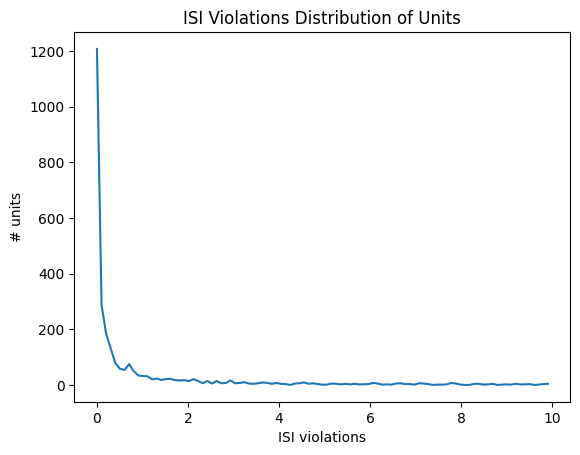
ISI Violations#
Inter-spike-interval violations are a classic measure of unit contamination. Because all neurons have a biophysical refractory period, we can assume that any spikes occurring in rapid succession (<1.5 ms intervals) come from two different neurons. Therefore, the more a unit is contaminated by spikes from multiple neurons, the higher its isi_violations value will be.
The calculation for ISI violations comes from [Hill et al., 2011]. Rather than reporting the fraction of spikes with ISI violations, their metric reports the relative firing rate of the hypothetical neurons that are generating these violations. You can interpret an ISI violations value of 0.5 as meaning that contamining spikes are occurring at roughly half the rate of “true” spikes for that unit. In cases of highly contaminated units, the ISI violations value can sometimes be even greater than 1.
data = units['isi_violations']
bins = np.linspace(0,10,100)
hist, bin_edges = np.histogram(data, bins=bins)

fig, ax = plt.subplots()
ax.plot(bin_edges[:-1], hist)

plt.xlabel("ISI violations")
plt.ylabel("# units")
plt.title("ISI Violations Distribution of Units")
plt.show()
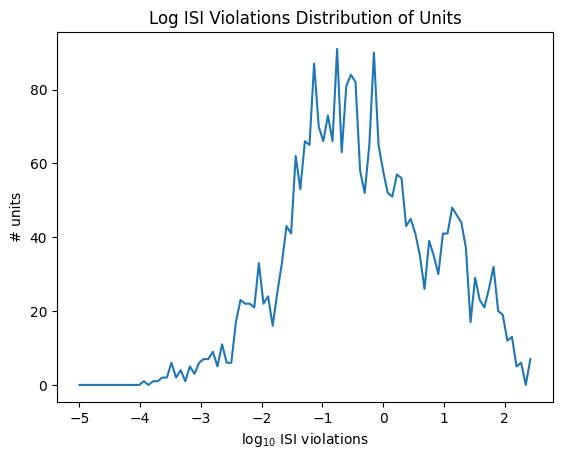
data = np.log10(units['isi_violations'])
bins = np.linspace(-5,2.5,100)
hist, bin_edges = np.histogram(data, bins=bins)

fig, ax = plt.subplots()
ax.plot(bin_edges[:-1], hist)

plt.xlabel("log$_{10}$ ISI violations")
plt.ylabel("# units")
plt.title("Log ISI Violations Distribution of Units")
plt.show()
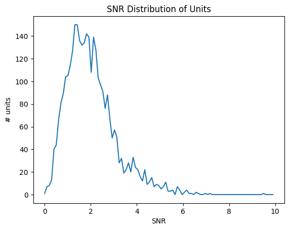
SNR#
Signal-to-noise ratio, or SNR, is another classic metric of unit quality. It measures the ratio of the maximum amplitude of the mean spike waveform to the standard deviation of the background noise on one channel.
data = units['snr']
bins = np.linspace(0,10,100)
hist, bin_edges = np.histogram(data, bins=bins)

fig, ax = plt.subplots()
ax.plot(bin_edges[:-1], hist)

plt.xlabel("SNR")
plt.ylabel("# units")
plt.title("SNR Distribution of Units")
plt.show()
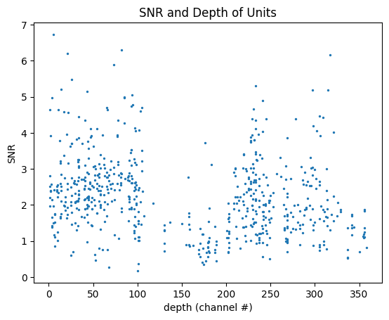
SNR Over Depth#
We can use SNR to evaluate the noisiness of data along a probe. Below is a plot that shows the SNR and depth distribution of units on an individual probe. Because of the way that probe and channel identities aren’t stored in the unit table, a little bit of extra work is required. Select the probe you want to make a plot for by setting probe_name to one of the options below. It’s worth noting that not all channels on a probe will have units, so not all depths on the plot will have valid average SNR values.
print(nwb.devices.keys())
dict_keys(['probeA', 'probeB', 'probeC', 'probeD', 'probeE', 'probeF'])
probe_name = "probeB"
# get list of channels on this probe
electrodes = nwb.electrodes.to_dataframe()
channel_ids = set(electrodes.index[electrodes["group_name"] == probe_name].tolist())

# make scatterplot where each point is a unit, with a channel # and an SNR
channel = []
snrs = []
# for unit in table, if it belongs to this probe, get its local index (channel #) and its snr
for i in range(len(units)):
    peak_channel_id = units["peak_channel_id"][i]
    if peak_channel_id in channel_ids:
        # get peak channel local index
        local_idx = electrodes.local_index[peak_channel_id]
        # get snr
        snr = units.snr[i]

        snrs.append(snr)
        channel.append(local_idx)
fig, ax = plt.subplots()
ax.set_xlabel("depth (channel #)")
ax.set_ylabel("SNR")
ax.set_title("SNR and Depth of Units")
ax.scatter(channel, snrs, s=2)
<matplotlib.collections.PathCollection at 0x211630ae320>
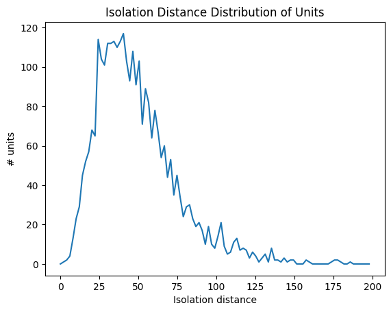
Isolation Distance#
Isolation distance is a metric based on the principal components (PCs) of a unit’s waveforms. After the spike sorting step is complete, the waveforms for every spike are projected into a lower-dimensional principal component space. The higher the isolation distance, the more a unit is separated from its neighbors in PC space, and therefore the lower the likelihood that it’s contamined by spikes from multiple units. For more information on this, read the Allen SDK Documentation.
data = units['isolation_distance']
bins = np.linspace(0,200,100)
hist, bin_edges = np.histogram(data, bins=bins)

fig, ax = plt.subplots()
ax.plot(bin_edges[:-1], hist)

plt.xlabel("Isolation distance")
plt.ylabel("# units")
plt.title("Isolation Distance Distribution of Units")
plt.show()
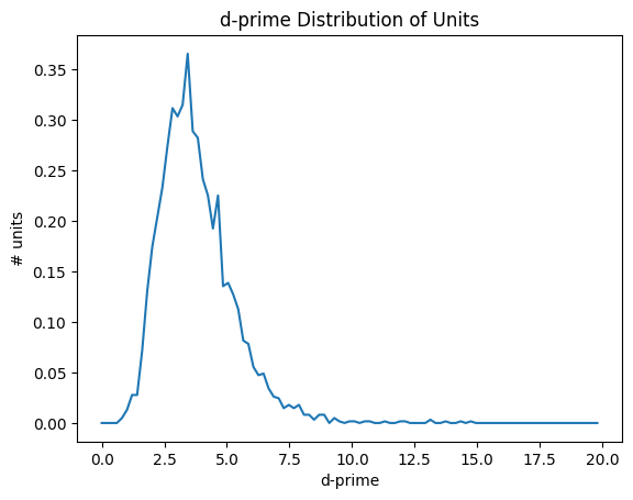
d-prime#
Like isolation distance, d-prime is another metric calculated for the waveform PCs. It uses linear discriminant analysis to calculate the separability of one unit’s PC cluster and all of the others. A higher d-prime value indicates that the unit is better isolated from its neighbors.
data = units['d_prime']
bins = np.linspace(0,20,100)
hist, bin_edges = np.histogram(data, bins=bins, density=True)

fig, ax = plt.subplots()
ax.plot(bin_edges[:-1], hist)

plt.xlabel("d-prime")
plt.ylabel("# units")
plt.title("d-prime Distribution of Units")
plt.show()
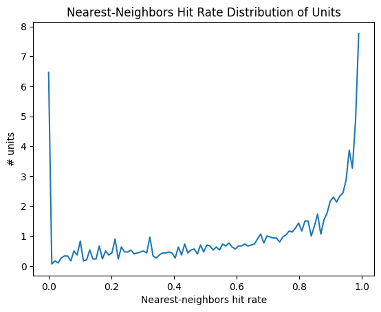
Nearest-neighbors hit-rate#
Nearest-neighbors hit rate is another PC-based quality metric. It’s derived from the ‘isolation’ metric originally reported in [Chung et al., 2017]. This metric looks at the PCs for one unit and calculates the fraction of their nearest neighbors that fall within the same cluster. If a unit is highly contaminated, then many of the closest spikes will come from other units. Nearest-neighbors hit rate is nice because it always falls between 0 and 1, making it straightforward to compare across different datasets.
data = units['nn_hit_rate']
bins = np.linspace(0,1,100)
hist, bin_edges = np.histogram(data, bins=bins, density=True)

fig, ax = plt.subplots()
ax.plot(bin_edges[:-1], hist)

plt.xlabel("Nearest-neighbors hit rate")
plt.ylabel("# units")
plt.title("Nearest-Neighbors Hit Rate Distribution of Units")
plt.show()
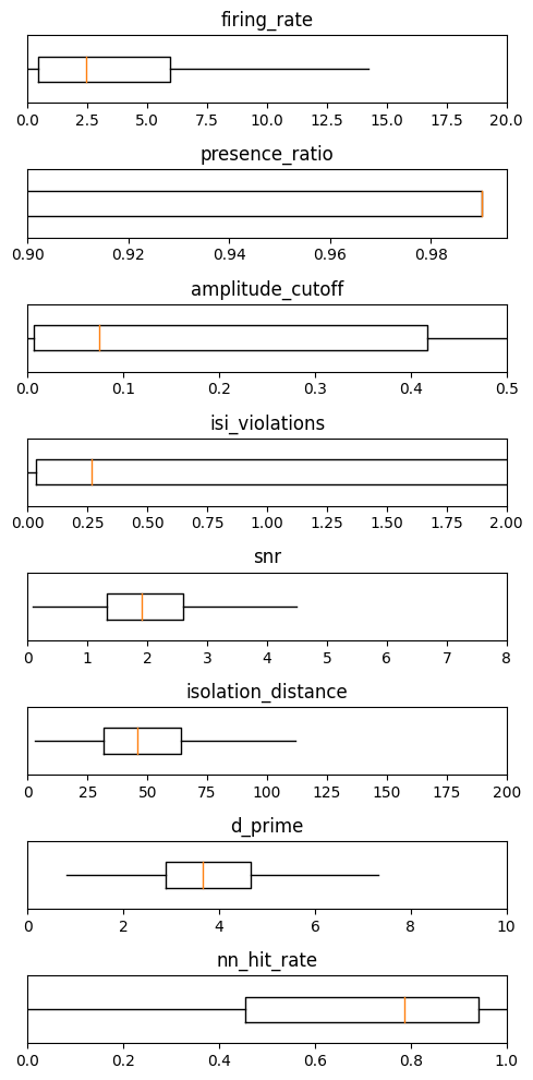
Summary#
metrics = ['firing_rate', 'presence_ratio', 'amplitude_cutoff', 'isi_violations', 'snr', 'isolation_distance', 'd_prime',
           'nn_hit_rate']
ranges = [[0,20], [0.9,0.995], [0,0.5], [0,2], [0,8], [0,200], [0,10], [0,1]]
_ = plt.figure(figsize=(5,10))

for idx, metric in enumerate(metrics):
    data = units[metric]
    # remove NaNs
    data = np.array(data)[np.invert(np.isnan(data))]

    plt.subplot(len(metrics),1,idx+1)
    plt.boxplot(data, showfliers=False, showcaps=False, vert=False)

    plt.ylim([0.8,1.2])
    plt.xlim(ranges[idx])
    plt.yticks([])

    plt.title(metric)

plt.tight_layout()